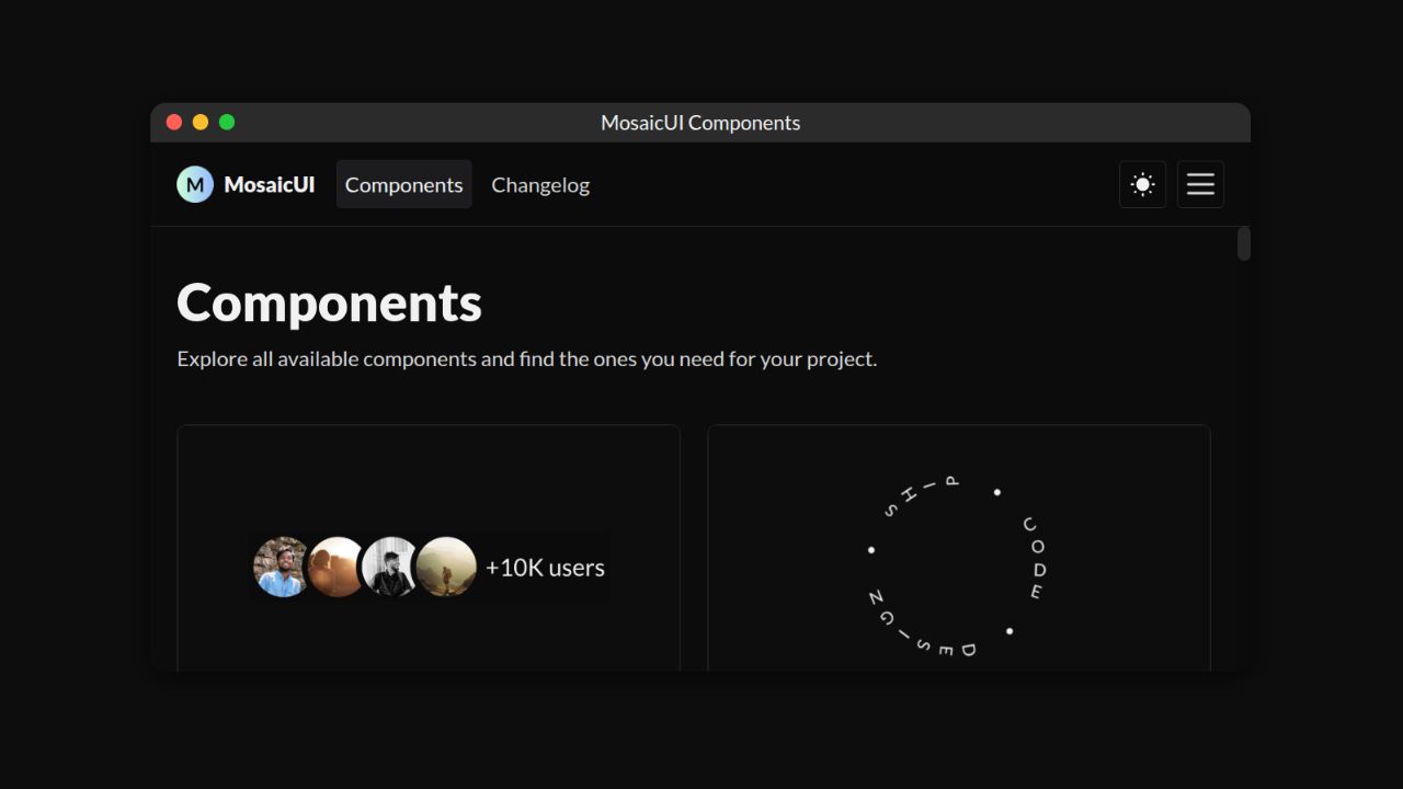
Components
Explore all available components and find the ones you need for your project.
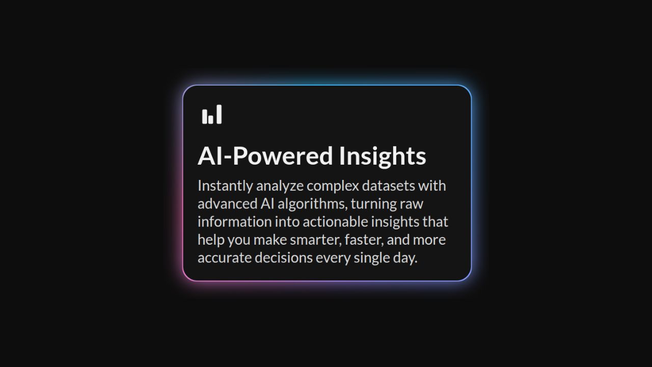
Aura Border
A dynamic border component with rotation, blur, and glow effects for highlighting content.
Avatar Group
A component to display a group of user avatars representing members of a team, project, or community.
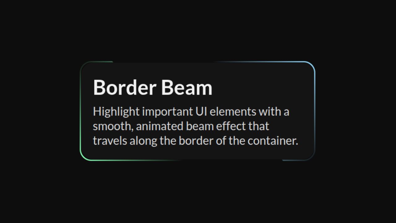
Border Beam
A customizable animated beam that travels along the border of a container for a dynamic visual highlight.
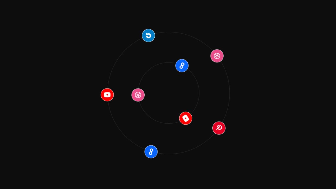
Circular List
A circular orbit component that displays elements around a center and rotates them continuously, ideal for galleries, dashboards, and navigation menus.
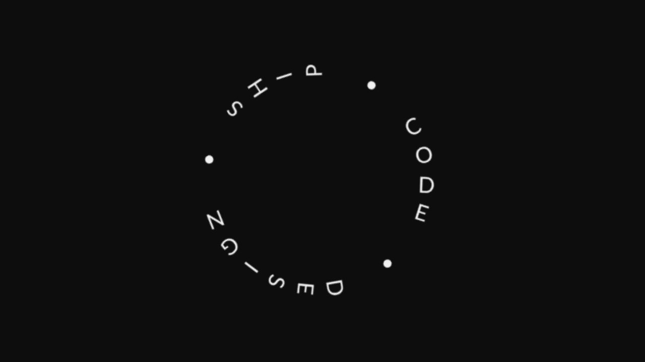
Circular Text
A flexible component for rendering text along a circular path with customizable styling and rotation.
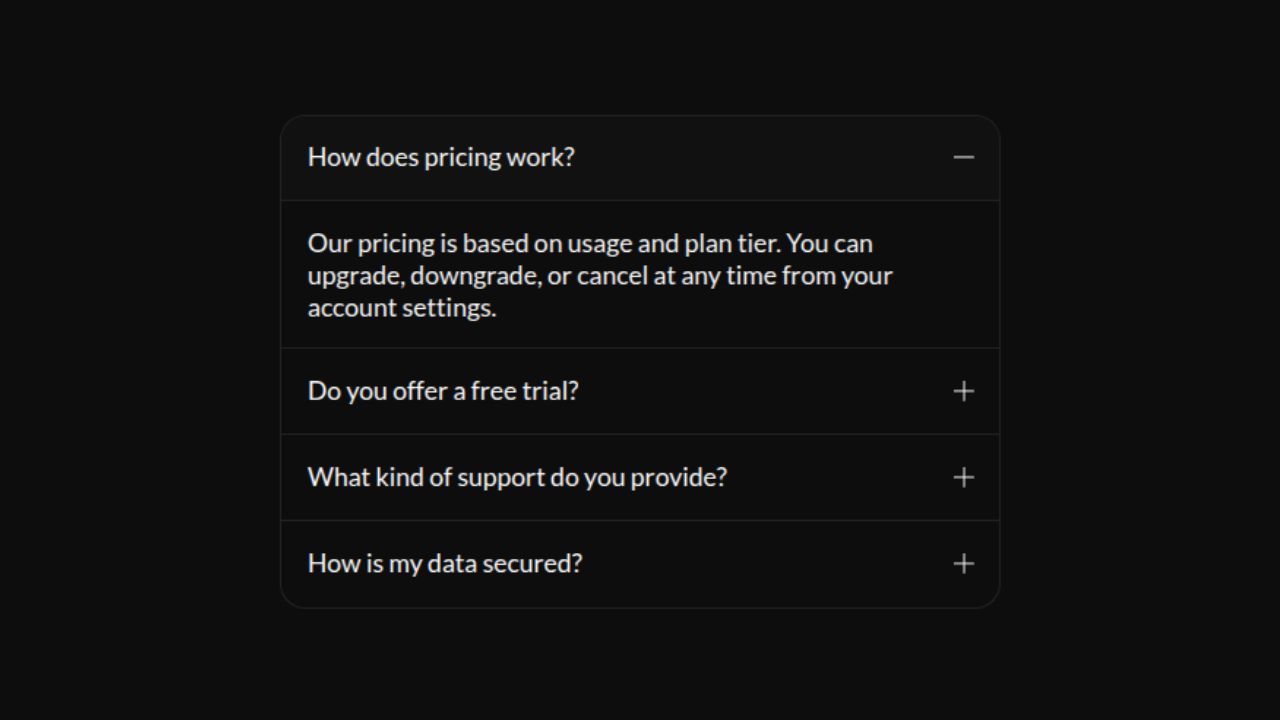
Classic Accordion
A classic accordion component that expands and collapses content sections to organize information efficiently.
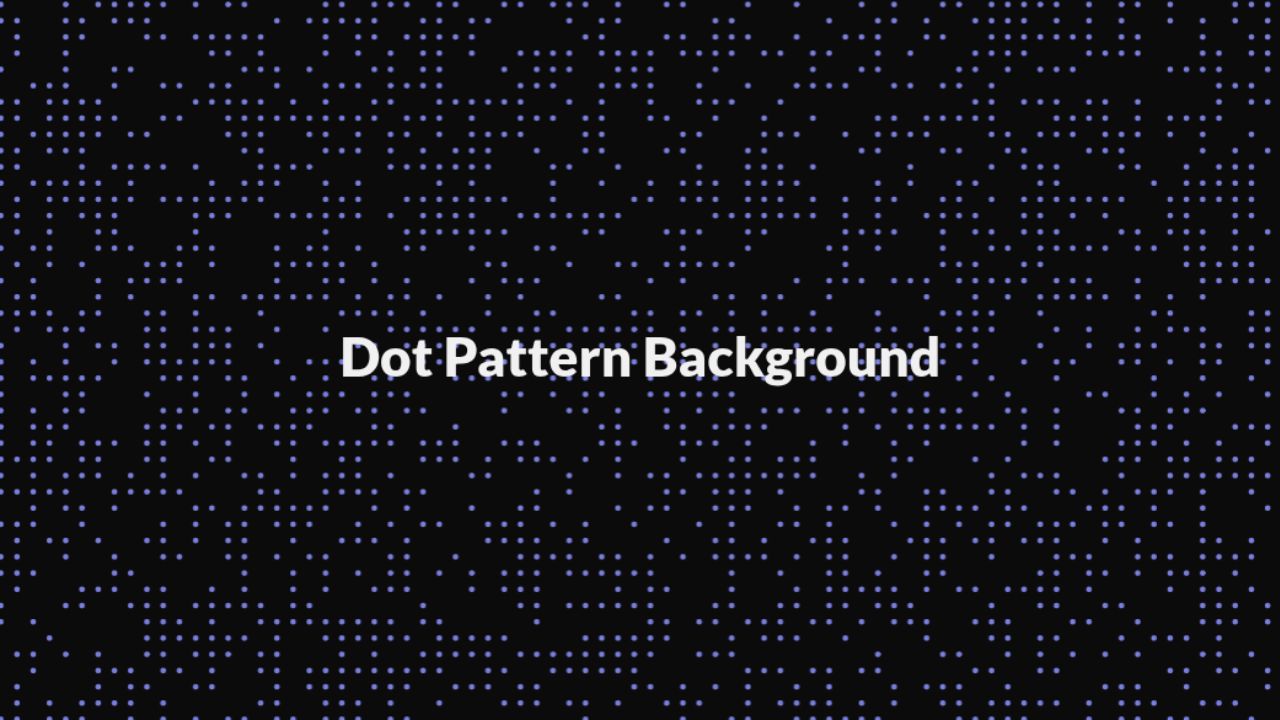
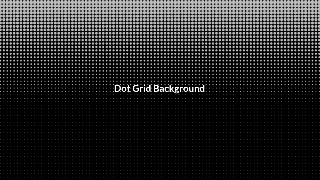
Classic Dots Pattern
Flexible dotted background component with configurable color, spacing, scale, and multiple pattern variants, designed to wrap and enhance UI sections with subtle visual texture.
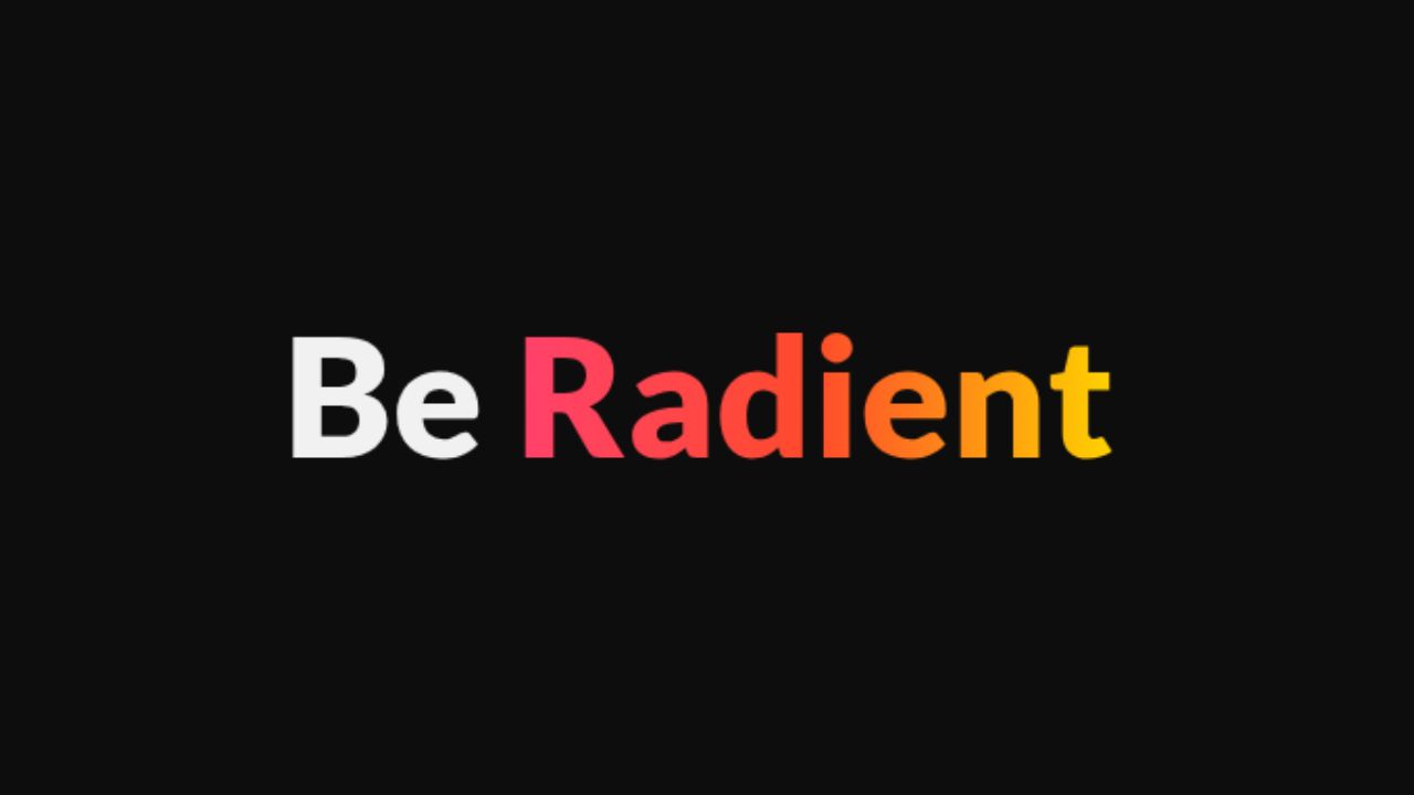
Colorized Text
Applies customizable multi-color styling to text content.
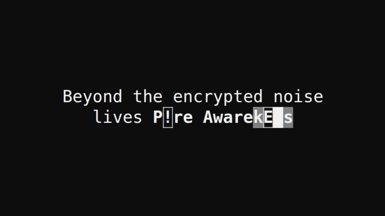
Decrypting Text
Displays text with a decrypting animation effect, revealing the final content through randomized characters.
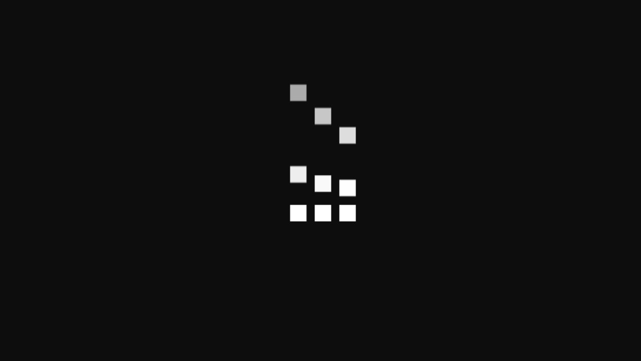
Dot Grid Gradient
A customizable dot grid with gradient scaling, allowing control over dot size, color, and shrink direction.
Falling Tiles
Tiles fall from the top, settle into a grid for a moment, and then descend one by one in a looping animation.
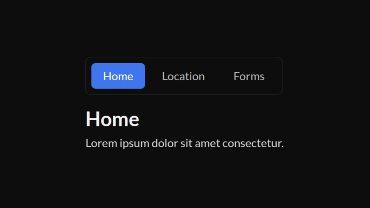
Floating Indicator Tabs
A lightweight accessible tab component designed with a fluid motion indicator that delivers smooth, spring-based transitions.
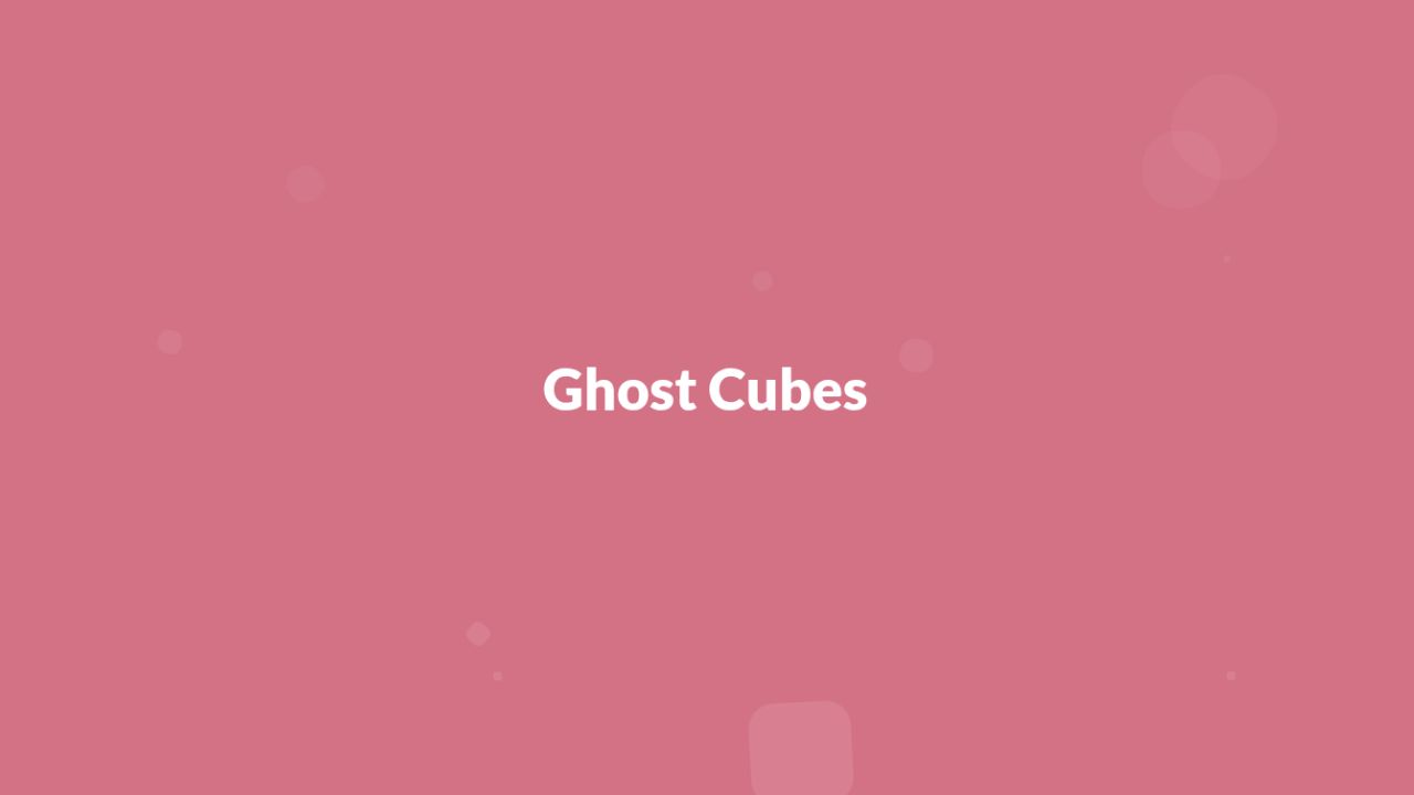
Ghost Cubes
Translucent cubes drift upward and fade away, creating a subtle ghost-like background motion.
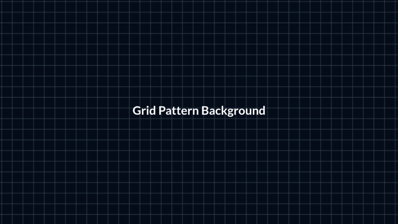
Grid Pattern
A customizable animated grid background component for creating dynamic patterned layouts behind content.
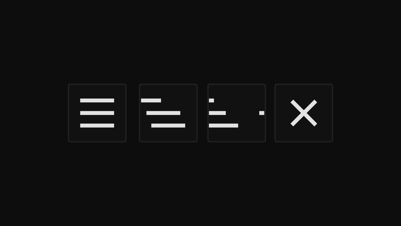
Hamburger Button
An animated hamburger button that smoothly toggles between menu and close (X) states.
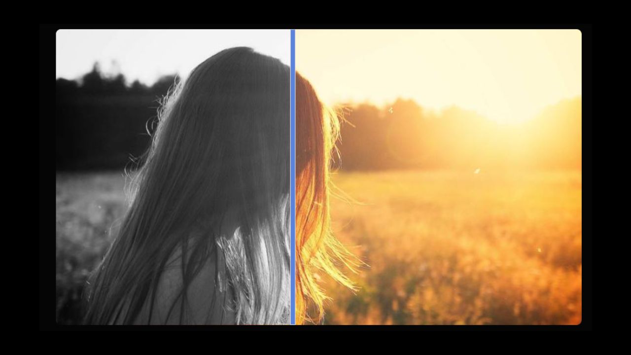
Image Comparison Slider
An interactive before-and-after image comparison slider that lets users visually explore differences with drag control.
Luminous Card
A card wrapper component that adds a subtle cursor-tracking glow to enhance visual feedback in interactive UIs.
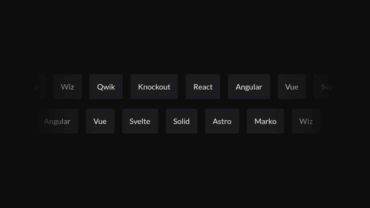
Marquee
A flexible scrolling layout for showcasing repeating content like logos, announcements, or testimonials.
Maze Pattern
A maze-themed background with customizable colors and size.
Modular Grid
A composable layout grid that provides responsive breakpoints and configurable variants for building structured UI sections.
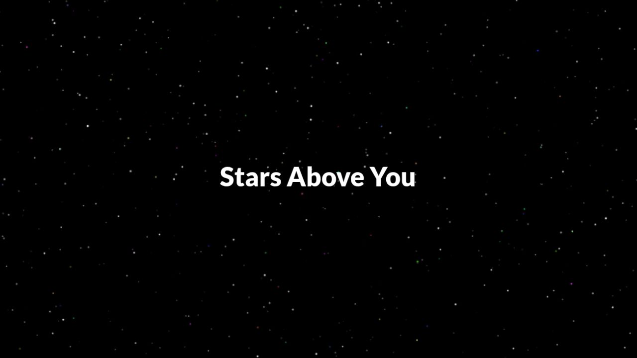
Night Sky
A dynamic night sky background with twinkling stars, customizable density, and content layered on top.
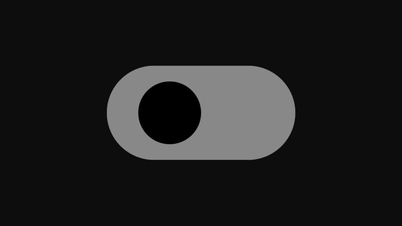
Orbit Toggle Switch
A dynamic toggle switch where both the track and thumb rotate smoothly when switching states, creating a visually engaging interaction.
Rolling Letters
Displays a word where each character animates with a vertical rolling effect, creating a dynamic text reveal.

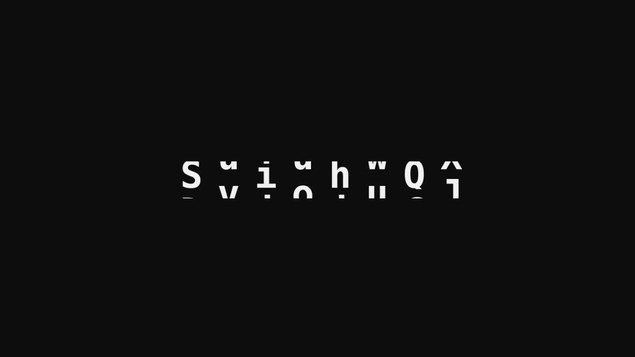
Shining Text
A smooth light shine moves across the text, making it look bright and eye-catching.
Showcase Window
A container for desktop app previews, showing features or screenshots in a polished frame for promotional pages.
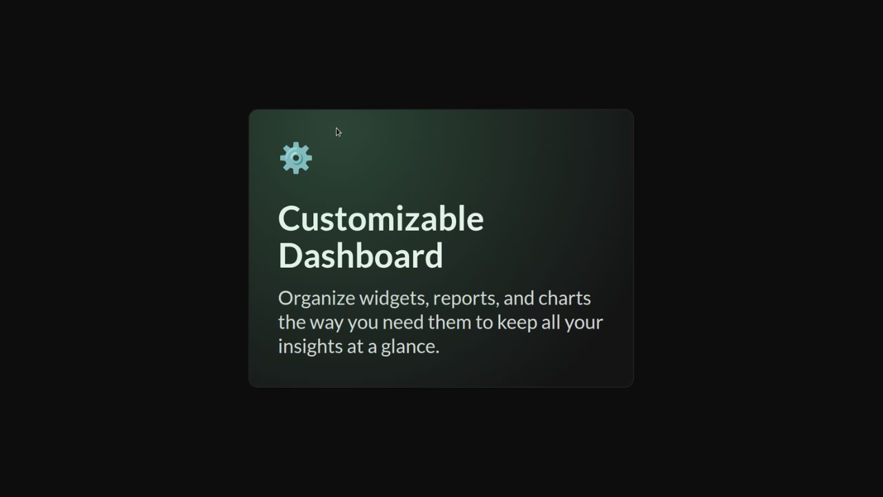
Spotlight Card
A container for interactive cards with a hover spotlight effect, ideal for showcasing features or highlights.
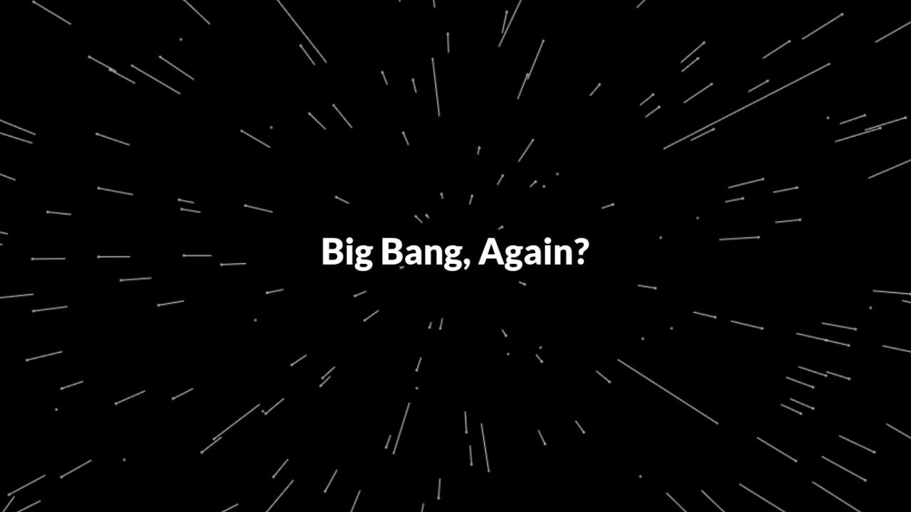
Star Field
A dynamic star field background with adjustable speed, creating a sense of motion and depth.
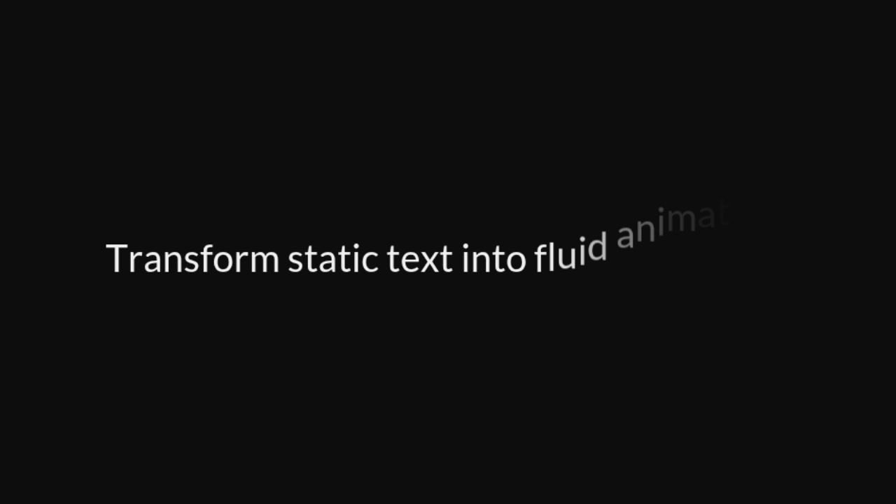
Text Animation
Create dynamic text effects by staggering letters or words with configurable motion and timing, great for hero sections, promotional content, or onboarding screens.
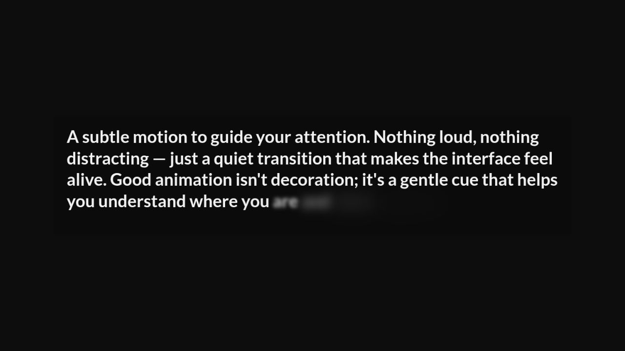
Text Emerge
Animates text by gradually turning blurry letters into clear ones, word or letter by letter.

Text Reveal
A text with a moving blob that reveals the text as it passes.
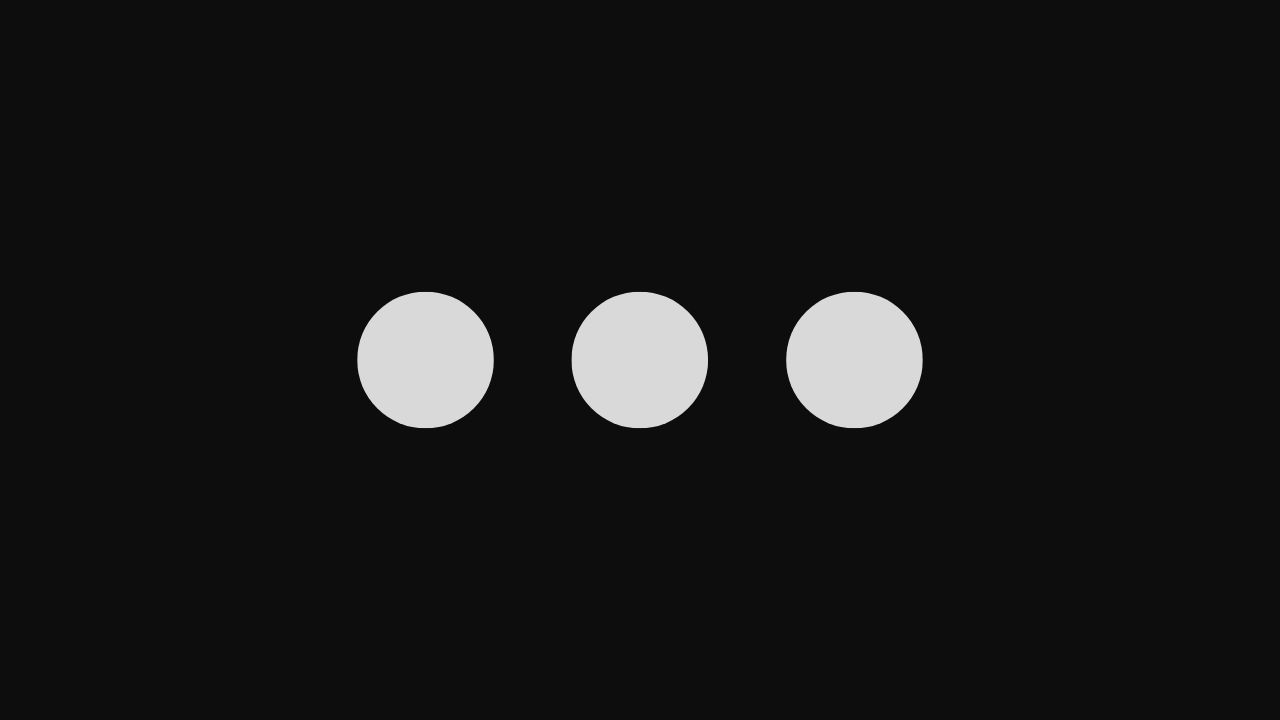
Three Dots
A minimal three-dot animated loader that indicates ongoing processing or content loading.
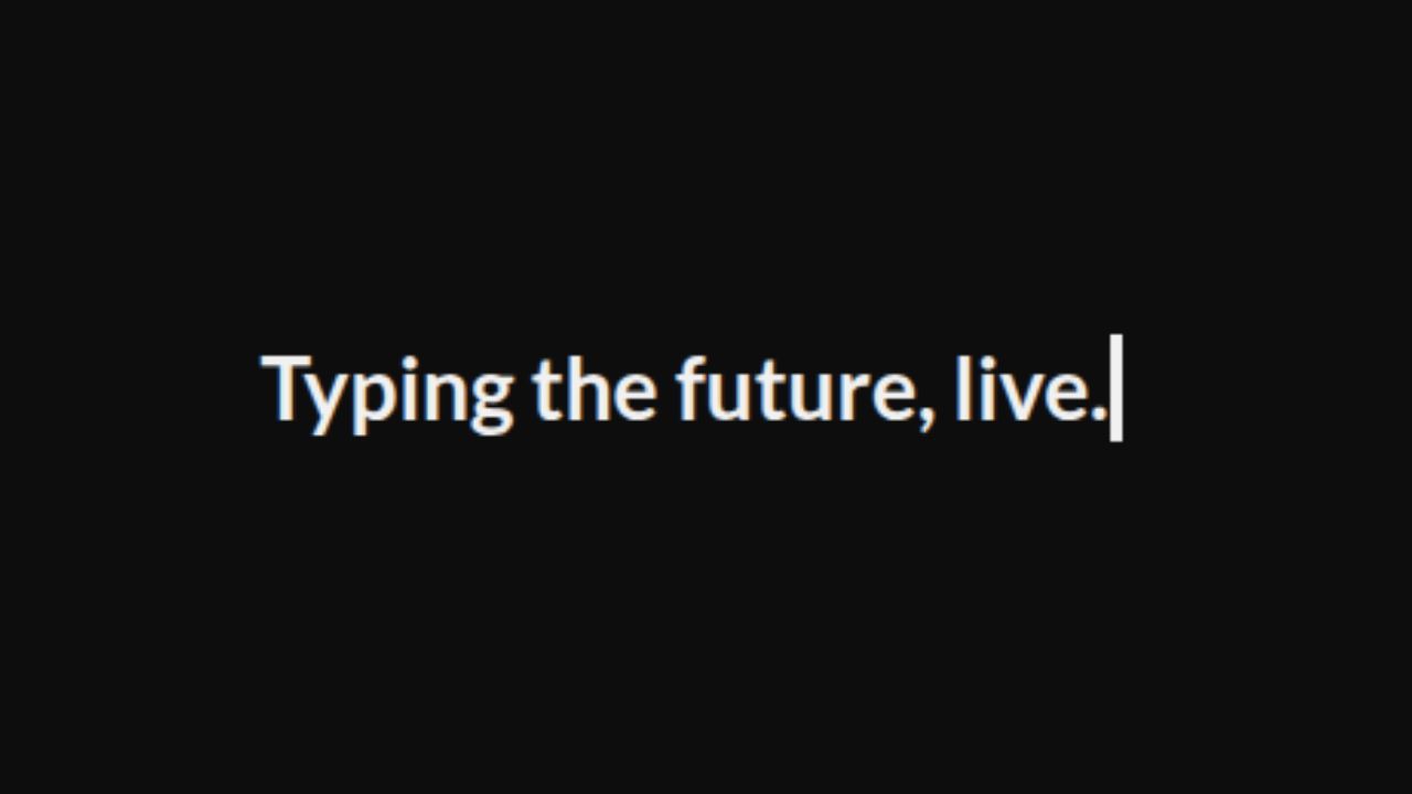
Typewriter Animation
Animates text like a typewriter, with optional speed, cursor, and styling controls.
Vertical Text Slider
Slides through an list of text vertically, pausing briefly on each item before transitioning to the next.
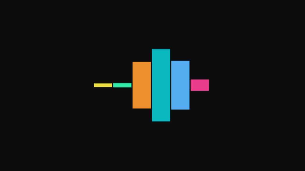
Wave Bars
A rhythmic wave loader with cascading vertical bar motion.
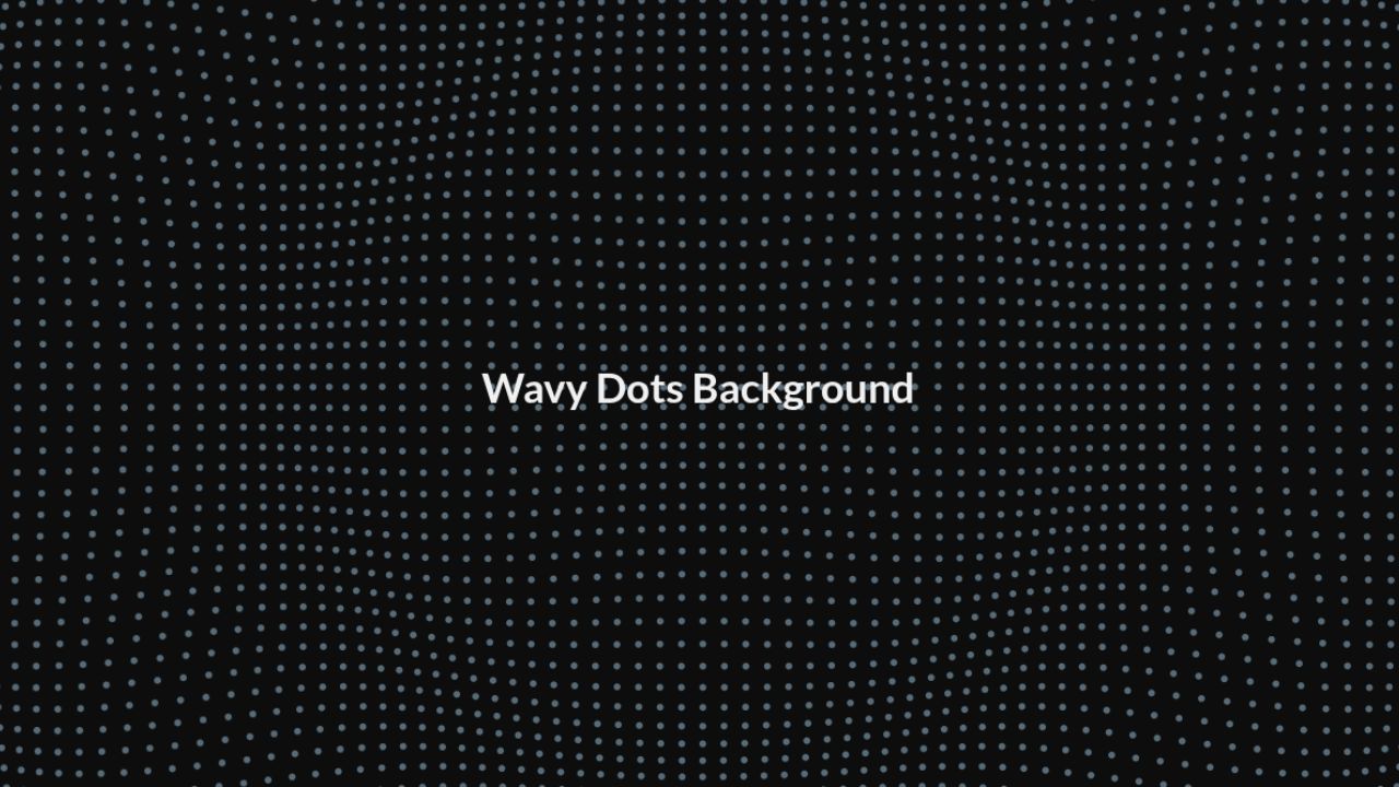
Wavy Dots
A subtle animated background where dots gently pulse toward the center in a harmonic wave motion.
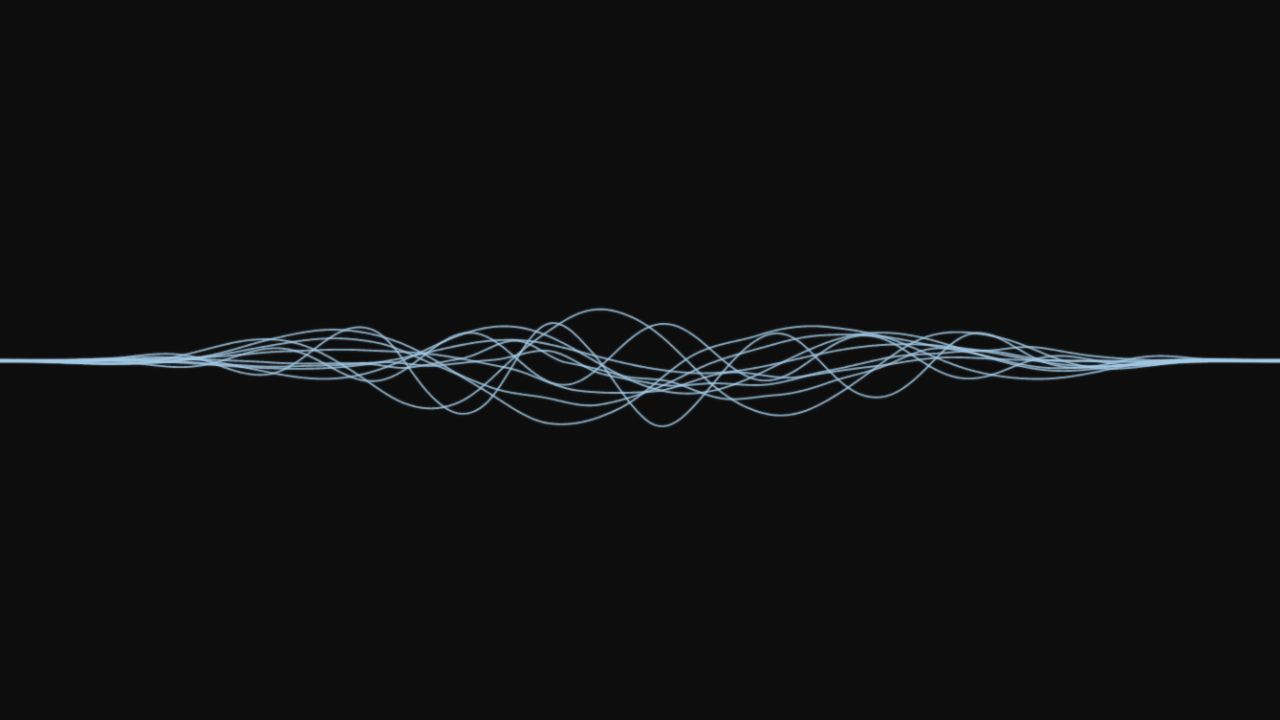
Wavy Threads
A smooth, noise-driven threads animation for adding subtle, organic motion to interfaces.